
How to Effectively Use Stock Photos For your Blog or Business
Most business owners know that imagery and visual content is important for their brand and user engagement. However, many might not understand how to use these images effectively. In order to adequately attract and connect with your audience you need to be using stock photography strategically. Just because you’ve hopped on the bandwagon and have started using stock photos, doesn’t mean that you’re doing it well.

By using stock photos within your blog posts, social media graphics, presentations or any other marketing materials, your audience engagement will automatically increase because they will immediately develop a better connection with your content. 90% of all information that is transmitted to the brain is visual and is processed 60,000x faster than text (Hubspot).
Adding imagery to webpages and blog posts, also can increase your Google SEO ranking. Google perceives multi-media as more valuable, and therefore favorably impacts your page rankings (Backlinko).
With that being said, just adding any old stock photo won’t increase your marketing endeavors or your user engagement. These photos need to be relevant, relatable and consistent with your branding. If chosen correctly, your stock photos can work FOR you by attracting the right audience, strengthening your visual brand and increasing your brand's recognition.
So how can you effectively use stock photos?
Relevant Content within your Imagery
Make sure the photos you choose relate well to the topic they’re being associated with. This is pretty self explanatory, however I still often see some odd photo/content pairings as I’m scrolling through my Pinterest feed.
The other day, I saw a pin about SEO best practices, but the photo used was of an ice cream cone.
Uhhh…. ?
Adding relevant imagery not only clarifies the subject for your audience, but it also helps attract the RIGHT audience. If I’m scrolling through my feed and see a photo of a Mac computer with pantone books spread across the desk, I’m probably going to stop and read the title and description because that photo is relevant to me and my line of work. (I would also stop to look at a post with any Beyonce photos or cat memes attached... I know what I like, okay?!)
So when I’m scrolling through Pinterest, I’m probably not going to look very hard at the pin with an ice cream cone on it, because subconsciously I know that ice cream isn’t relevant to me or what I'm looking for.
... Okay ice cream is my favorite food group, but I’m not on Pinterest to read about ice cream so I normally would scroll past it.
Images are the fastest piece of information our brains can process, so capitalize on this! Take the time to find the RIGHT stock photo for your project.

2. Photos should give off a similar style as your brand
Using similar and consistent styles among all of your photos helps tremendously with building a cohesive visual brand. When your brand is consistent across every platform it looks professional, it’s memorable and it just. looks. pretty! This is especially true on pages where you see collections of multiple photos, like Instagram, Pinterest or a blog gallery page on your website (like mine).
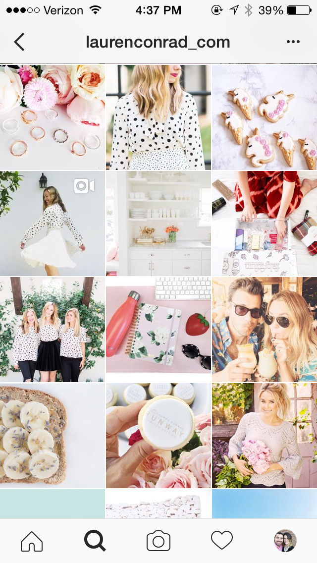
A great example of this is from my girl, LC (thats Lauren Conrad for any of you who aren’t familiar with my future BFF and the former Hills cast member).
Here are her THREE different Instagram accounts (because when you’re that successful, why not have three?). You can tell that all three accounts are styled with the same type of images that are all very reflective of her feminine, soft and classic brand. And her whole feed looks amazing because of it!


Related Post –>> How to Design a Feminine Brand (+ Resources to Help You Do So!)
As you can see, the style of your imagery can have a major impact on the success of your visual branding.
So don’t just choose that photo that you find in your search. Choose the photo that matches your brand in some way, shape or form. Maybe the it incorporates the same color as your logo, or maybe it’s an old fashioned, black and white photo because your brand has a vintage and hipster-y (totally not a word) feel to it. Whatever it may be, choose your photos wisely!
3. Appropriate Colors
Choosing stock photos with similar colors to you brand is one of the ways I mentioned above as a strategy to create a consistent brand identity among your images. By choosing photos that match your brand colors, your imagery will be consistent and make your brand memorable.
For example, maybe all of the photos you use have a large amount of white space because white is a dominant color in your brand. Or maybe your photos always incorporate the color pink somehow. If you’re taking your own stock photos, you could take multiple shots of the same scenes or subjects, but shoot them at different angles or in different arrangements (check out Caitlin Bachers Instagram account to get an idea of what I mean by this).
Brit + Co. is a great example of this concept as well. The majority of the photos they use tend to always incorporate bright pastel colors (usually turquoises, yellows and pinks) – no matter what the subject matter is.

What happens if you find a photo you’re dying to use because it matches in both content and style perfectly, but its not the right colors?
Add a color overlay!
My blog title images are a great example of this. All you have to do is add a layer of color over top of your image and change the opacity of the color layer to multiply.
Here’s a quick walkthrough for Photoshop and Illustrator users:
In photoshop, change the color layer from “Normal” to “Multiply” and make sure the color layer is above the photo layer.

In Illustrator, open the Appearance panel (Window > Appearance) and change the opacity to “Multiply” by clicking on the orange “Opacity” button and using the drop down menu that appears.

Adding brand color overlays to your stock photos will successfully relate the image to your visual brand automatically.
4. Use stock photos that evoke emotion
If it relates well to your topic, use images that evoke an emotion. Whether its fun, happy, exciting, sad, scary, angry, or the ugly Kim K crying face. Any image that will convey an emotion to your reader – or even better, make them feel that emotion – will immediately attract them to your content. As readers, we want to be able to relate to content. Adding imagery can successfully do this much faster than any words, titles, catch phrases or descriptions can.
Photos conveying emotion can also be a tactic to humanize your brand. Conveying a human emotion can impact your reader by connecting them to your brand on a deeper level than they might have had otherwise.
5. Avoid Cheese Town
I’ve totally mentioned this in past posts, but I will forever state it again until cheesy and ugly stock photos are forever gone from this world… which will be never, so choose wisely, friends!
Please, for all that is holy, do not use cheesy, staged, cliché stock photos.
They cheapen your brand, they’re not relatable or believable and they’re ugly. Unless you’re running an ad campaign that is purposely over the top and cheesy, these photos will only bring down your entire brand.
It’s important to use photos that seem genuine, authentic and purposeful. They should feel relatable and attainable. Avoid any photos that seem staged, over the top or unbelievable: you know, like the photo of the entire office huddled around the computer smiling and pointing at the screen; or the posed, cheerful receptionist thats happily taking your call at her perfectly organized desk. Let’s be real. We’ve all been in an office before and those perfectly staged stock photos are not fooling anyone.
Luckily for you, there is a one-stop-shop for all of your stock photo needs that meet ALL FIVE of these expectations (especially this last one, which lets be honest, is the most important).