How my Logo has Earned me Thousands of Dollars in Business (and How Yours Can Too!)
I want to let you all in on a little secret I call “The Power of the Almighty Logo.” Okay I don’t actually call it that and probably never will ever again, but it sounded good in the moment. But here’s the actual secret: I have won several clients simply because they liked my logo.
Seriously. I’m really not kidding.
In fact, I recently won a $1k job because I reached out to a potential client, who mind you had already had begun working with a different graphic designer, but told me he really liked my logo and because of that, wanted to sit down and talk with me. Just like that I won (and kind of stole?… opps!) the job from the other designer, all because my logo was in my email signature.
Because my logo has worked so well for me, I wanted to share with you today what I believe makes my logo so successful so you too can have your visual branding work FOR you instead of just look pretty on your website.
The Main Purpose of My Logo is to Describe Myself
Although there are several key design elements that make my logo successful, the MOST important reason my logo gets so much attention is because it’s main purpose is to describe me. It describes my style, my interests, my aesthetic and my personality, all in one little logo. This overarching idea is why all of the combined elements have come together to create such an attention-grabbing logo.
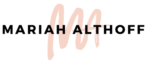
Overall, my design aesthetic is pretty clean, modern and sleek and I wanted that to be a key component to my logo. This is mainly why I used a sans serif typeface and put my name in a box. Nothing says clean and modern like a box with words in it, amirite?
However, I didn’t JUST write my name out. Instead I had to break it up into confusing little chunks because YOLO. Actually, I did this because it’s interesting and unconventional. For anyone who really knows me, the only conventional thing about me is I fan girl over T Swift along with the rest of the world. Otherwise I definitely march to the beat of my own drum, so why shouldn’t my logo?
The paint stroke represents my roots in design. I went to school for drawing and painting which was my original passion for art. I minored in graphic design because I knew it would pay the bills when I was an actual grown up, but until then I wanted to make art. My true love was drawing, but no matter what the medium, I loved going to art class and getting covered in charcoal or paint and creating something new every day. My art style has always been pretty abstract and messy, and because my art major is what lead me to designing in the first place, I wanted to incorporate that idea into my logo design.
Not only does the paint stroke indicate my journey in becoming a graphic designer, but it's also very symbolic of my overall personality. I tend to be a pretty sporadic person, always singing or dancing or doing something dumb. I’m carefree and don’t need things to be perfect (which is good because the sporadic, crazy person in me is usually playing a large role in the daily sh*t show that is my life). So the imperfect, quick swash of paint is a great way to illustrate who I am.
Unique Logos Draw More Attention
Combining all of these ideas ended up creating a pretty original logo. It’s definitely not anything like the majority of the logos you see all over the internet these days, and I love that. So what actual design concepts make this logo so interesting? I’m glad you asked! Let me tell you:
Movement
The paint stroke creates a movement in the logo that allows it to be dynamic and eye-catching. It looks like I just swiped down the paint brush and called it a day. The subtle detail of the paint starting behind the box and ending in-front of the box also helps convey this idea of movement within the logo design.
Texture
The paint also has some texture to it. Texture in a logo is not common. The texture shows the paint isn’t perfect. It looks quick, gritty and exciting, which makes for a really interesting logo. Side note - it's also not usually a great idea to have texture in a logo, especially if you need to use it at large sizes because texture usually comes from a raster image and can make printing more tricky (See related article ->> Raster vs. Vector to have a better understanding of this concept). For my business, I was never going to need my logo larger than a couple inches, so allowing the texture from the paint to come through was okay and was also important to me.
Modern Style
The typeface itself and the arrangement of the type is a very modern concept. Breaking up my name like I did makes it harder to read yes, but it allows it to be more of an icon instead of a word, which is exactly what I wanted this logo to be.
Dichotomy
The crispness of the geometric square and the modern typeface, mixed with the asymmetric, hap hazardous paint stroke makes for an interesting dichotomy. It shows a hard and soft side in one simple icon, causing you to spend a little more time looking at it than you would a normal logo.
So many people assume a logo is just there to look nice and be recognized. Although these are extremely important aspects of a logo design (obvs), I hope this article has shown you that it can be so much more than that. Obviously, no one is going to look at my logo and takeaway all of the concepts that went into it. However, because so much thought went into every element of this logo, I was able to symbolize and convey different emotions and characteristics which automatically make it an intriguing logo that people stop to look at and think about. What more could you want than people spending a little longer to look at your logo than someone else’s?
So How Can You Take Your Logo to the Next Level?
Put thought into it. Think deeper than pretty colors and fun fonts. Think about your business. I have put together a comprehensive Logo Brainstorming Guide to lead you through this exercise. Download it here!
Do some serious brainstorming! It won’t just have an affect on your logo design, but on your overall brand. So dig deep and do a brain dump of everything relating to you and your business. See what you can pull from it! I bet you will surprise yourself.
Are you in the process of designing your logo? If so, let me know how it’s going in the comments below! I hope this was helpful to your process!
