The Graphic Designer’s Guide to Using Professional Fonts (and Why I Stay Away from Free Fonts!)
*Anything marked with an asterisk is an affiliate link – I promise I only recommend products I use myself!
I know there are a lot of free fonts out there, but I want to teach you why I regularly choose to pay for professional fonts instead of relying on the free ones and why I recommend you do the same. The fonts you choose can make or break a design (or an entire brand identity!), so choosing high-quality fonts is crucial for the final outcome.


More font weights = More variety and versatility
As you may already know, brands should only use a total of 2-3 fonts within their brand identity—meaning any graphic you create for that brand should only use those 2-3 fonts every single time. This same rule holds for any one-off graphic you create, whether they belong to a certain brand identity or not. Using a font with a variety of text weights is a great way to “cheat” this rule and make it feel like you have a variety of fonts to use. Being able to choose from a selection of font weights will also help create a hierarchy within the design which is incredibly important for an effective and successful graphic. Free fonts, on the other hand, often have a limited choice of weights which makes free fonts much less versatile to use in a design.
You’ll have the proper license
If you read the fine print, you’ll find that many free fonts are free only for personal use – meaning you can’t legally use them for client projects or anything else that's business-related. Paid fonts, however, often come with a commercial license. With that being said you should always read the license terms or choose font foundries that intentionally keep their licenses uncomplicated and the most flexible. This is why I use Design Cuts* to purchase my fonts. Not only are they incredibly reasonably priced, but any font you purchase from Design Cuts includes an Extended License. This means you can use them to create both personal AND contracted client projects, you can use them for multiple projects, and you can use them to create free end products or for sale products.
Free fonts rarely give you that kind of flexibility for commercial projects. By building up a font library full of paid fonts, I’m able to design worry-free about the legality of the fonts I’m using because I can confidently design projects knowing that I have the proper license for each font!

The fonts are higher quality
As a general rule, fonts you pay for are going to be higher quality, both in how they’re made and how all of the letterforms interact with one another. High-end font designers spend hours ensuring the proper amount of kerning (the space between each letter) is perfect for each letter combination. Fonts, where this attention to detail is not considered, can be extremely obvious. Design is in the details, and the fonts you choose are no exception! They also ensure the letterforms are unified and the measurements and ratios of each character are optically aligned.
More character variations
Something many junior and self-taught designers may not know is that most paid fonts have alternate character styles that you can choose from. Meaning, you can tweak how the letters within a word itself and the overall graphic will work together. It’s tiny details like this that can completely elevate the professionalism of a font.
Ligatures, for instance, are special characters the combine two characters into one. You’ll find with fonts that don’t have ligatures, sometimes the characters can run into each other when put together or creates an awkward gap. This often happens with “ff”, “fi”, and “fl”, among other letter combinations. High-end fonts account for this and have special characters you can use in these instances to ensure your text looks clean and intentional. Here’s an example of this below.

High-quality fonts will also often include glyphs, which are alternate characters that you can use within your text. For example, the cursive font in the example below (which you can download here!*) has at least 5+ glyphs for each letter, allowing you to truly customize your type. In the example below I’ve utilized the glyphs for the L and the E in all three iterations.

It’s incredibly easy to utilize the glyphs function of fonts. To access them, highlight the letter you’re wanting to edit. If you see a blue bar appear below the letter, you’ll be able to hover over it where a flyout menu with the alternate characters will appear. You’ll be able to click through these glyphs and choose one that looks best with the text and format of your design!

Language Capabilities
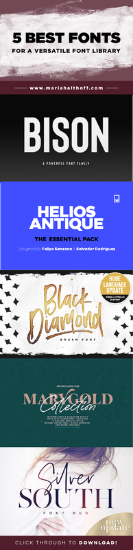
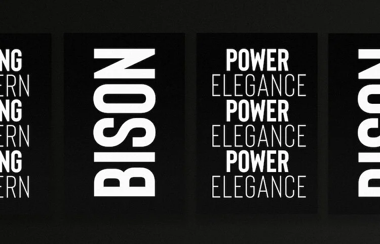
Finally, paid for fonts often are equipped with extended language capabilities. Meaning, characters from different languages are supported within the font itself. That way you’ll be able to use that font for languages aside from solely English. This is so important for anything you design that may be translated into multiple languages or that is intended for a client that does business another country. For example, one of my favorite fonts, Bison*, (which you can purchase in my custom font bundle!*) has extensive foreign support. This has come in handy when I’ve needed to include Spanish text in a design for one of my larger clients.
If you’re ready to expand your font library to include versatile, user-friendly fonts, I’ve partnered with Design Cuts to handpick a custom font bundle* that only my audience has access to – and the whole bundle is 50% off!
In the bundle, I included fonts I use daily for both myself and my clients. I constantly find myself gravitating to a handful of extremely versatile fonts, all of which are included in this bundle! I made sure to include two sans serif fonts, two serif fonts, and two fun handwritten and cursive fonts (in fact, Black Diamond is the font I use for my branding!), to give you a variety of fonts that would work well with any project!
Here’s what I handpicked for the bundle:
Bison
I love how bold, clean, modern, yet attention-grabbing this font is.


Helios Antique Essential
I LIVE for a clean, modern, versatile sans serif font like this. I honestly use it in 70% of the graphics I design!


Black Diamond
This is the font I use in my branding!


Silver South Font Duo
This includes two fonts in one – and it’s SO fricken pretty.


Marygold Font Duo Collection
Both of these fonts have so much character but can be used for so many things.


