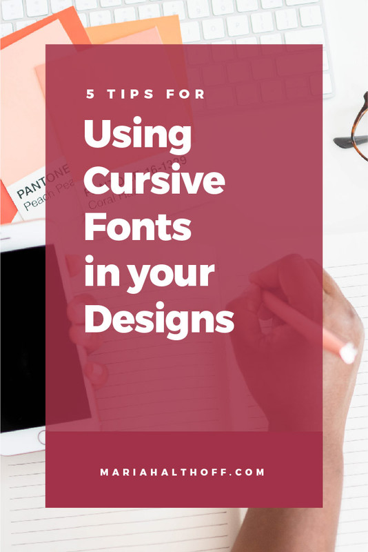
5 Tips for Using Cursive Fonts in Your Designs

*Anything marked with an asterisk is an affiliate link – I promise I only recommend products I use myself!
There’s no doubt that cursive fonts are one of the most popular trends in typography right now. And it’s not hard to see why! Script fonts are a subtle way to add a touch of elegance or sophistication to a design — if you know what you’re doing.
When used incorrectly, cursive fonts can quickly make a design look amateurish or DIY. So, without further ado, here are my top five tips for effectively using cursive fonts in your designs!

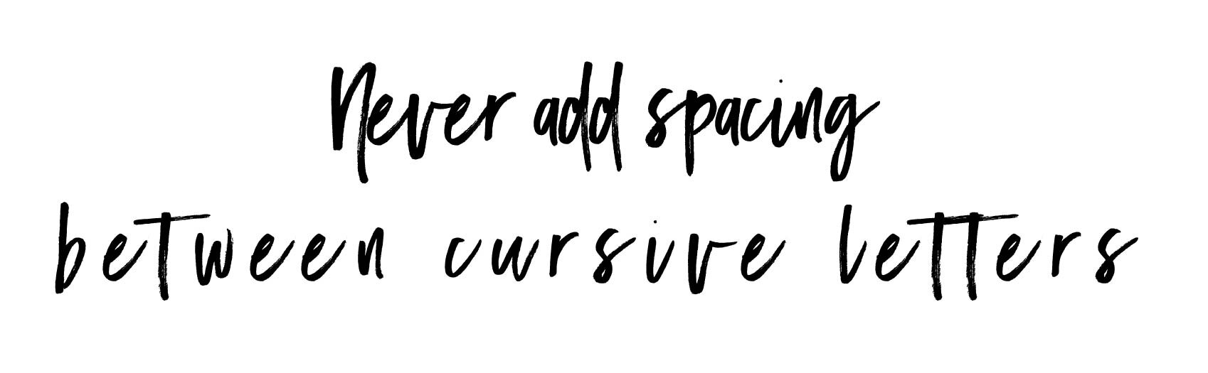
1. Say no to kerning.
Kerning, the process of adding or removing extra spacing between characters, is a great tool for adjusting awkward spaces between letters or adding some interesting visual detail to your type.
That being said, never add extra spacing in cursive fonts. These fonts are intentionally created so that the letters flow together in a specific manner, and messing with the kerning will often make the type look fragmented or disjointed.
>> Love the cursive font below? Download it here!*
2. Always pair a cursive font with a serif or sans serif font — never another cursive font.
While cursive fonts are perfect for adding an embellishment to a design, they can often be difficult to read. For that reason, you’ll always want to pair your script fonts with a clean, legible serif or sans serif font, and never with another script or handwritten font.
>> Love the cursive font below? Download it here!*


3. Use cursive fonts as an accent, not for important information.
As stated above, cursive fonts can be hard to read, so you don’t want to use them for conveying important information. Instead, use a serif or sans serif font for your headlines and key information, and use your cursive fonts to grab attention or add personality.
>> Love the cursive font below? Download it here!*

4. Cursive shouldn’t be in all caps.
Again, cursive fonts can be hard to read, and putting them in all caps further amplifies that issue. Plus, it doesn’t let the characters connect and flow together in the way they were designed to, which will throw off your entire design.
>> Love the cursive font below? Download it here!*

5. Customize your cursive fonts using glyphs and ligatures.
One of my favorite things about using cursive fonts is that it’s super simple to customize them and make them feel unique to your brand!
To try this, start by highlighting one of the letters in your design. If a blue bar appears underneath the letter, that means that you can choose to display that particular character in another way. Other fonts may also offer ligatures, which are special characters in a font that combine two or more characters into one. To find available ligatures for your fonts, simply type the name of the font into the drop down type menu and look for the “ligatures” option.
(Note - these features may only be available for high-quality paid fonts, which I talked about in a previous blog post.)

If you’re ready to test out your new knowledge of cursive fonts, this is my favorite place* to download high quality, commercial-free scripts fonts.