
7 Graphic Design Principles to Up-Level your Graphics
What many don’t realize about graphic design is that it goes beyond just looking hella' good. Design is also basic science, comprised of rules and principles that once implemented will immediately elevate your design skills. The technical side of design gets talked about a lot in the online world, but for whatever reaso, these basic design principles tend to get swept under the rug – which is super unhelpful for anyone trying to learn graphic design on their own. The only place I’ve actually been taught these principles was in design school, so I’m sharing them with you today so that you can be a rockstar designer too!

I wholeheartedly believe that if you learn and take into account these seven design principles every time you design a new project, your visuals will immediately stand out from the competition and you’ll be one step closer to being a pro designer yourself. This might be one of the most valuable posts I’ve ever written, so keep reading!
Let’s get started, shall we?!
1 | Balance
Your graphics need to have a sense of balance. This isn’t to say that each side needs to be perfectly symmetrical, but the amount of visual weight on each side should feel cohesive and intentional to create this feeling of balance.
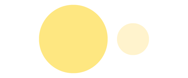
Visual weight can be determined by three different design factors:
Color: Bolder, brighter colors carry more visual weight than softer, lighter colors.
Size: The larger the design element, the more visual weight it has.
Thickness: Thicker lines carry more visual weight than thin lines.

Using these three factors you can create two types of balance: Symmetrical and Asymmetrical
Symmetrical balance is when the visual weight is distributed evenly between both sides of the graphic
Asymmetrical balance is when visual weight is intentionally and thoughtfully unequal between the two sides. In these scenarios, you're often using white space as visual weight to balance the other side of your graphic. (More on what white space is in a minute).
Tips for using balance in your design:
Typography
Font pairings rely almost completely on asymmetrical balance. Pairing one dominant font (like one font that’s bold or draws more attention like a brush font or calligraphy font) with a more subtle basic font (like Helvetica or anything that feels more simplified) will create a perfect font pairing by using asymmetrical balance to your benefit.
Related Post –>> How to Choose the Best Font Pairing for your Brand
Colors
You can create either symmetrical balance or asymmetrical balance to produce an effective color palette.
Symmetrical color palettes will use colors that all seem to have the same brightness or intensity – and therefore each carries an equal visual weight. They should all feel like they cohesively work together without drawing attention to any one color in particular.
An asymmetrical color palette will typically use one or two colors that dramatically stand out among the others. For example, using a black, white and red color palette creates an asymmetrical balance because the red takes the majority of the visual weight but is balanced out by the addition of black and white colors it’s paired with.
Related Post –>> How To Create the Perfect Color Palette for your Brand
White Space
White space, or the amount of negative space where no design elements take up room, is a design element in itself. You can use white space to balance out your design.
Completely filling your page with crap won’t help balance your design, in fact it makes it feel unprofessional and overwhelming. Use white space as a design element in itself because it too has visual weight. You can do that by either creating an equal amount of white space on each side of your graphic in order to give it a symmetrical balance or by using a large amount of whitespace on one side to balance out the design elements on the other in order to use an asymmetrical layout.
Either way, whitespace is your FRIEND. Use it as much as you can!
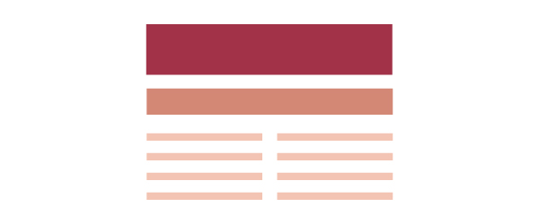
2 | Proximity
Proximity is when you group related items together so that it is visually clear they’re related. This helps create organization within your graphic which causes information to be remembered more easily. Our brains love organization, so when a graphic is organized appropriately, it's both visually appealing and easier to consume.
Proximity also makes white space feel more organized, and therefore more balanced. (See how these are all starting to relate?)

Tips for using proximity in your design:
Typography
Grouping together related text is HUGE in making your graphic easier to consume. Make sure related headers, sub-headers, and body text are all grouped together accordingly so that it's super obvious that they're all talking about the same thing.
Related Post –>> Typography Do's and Don'ts
Imagery
Grouping imagery closely with related text will again make your graphic easier to consume and also easier to remember. Because so many of us are visual learners, grouping imagery with related text makes us much more likely to remember the information associated with it.
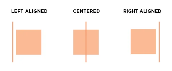
3 | Alignment
Every design element placed in your graphic should be visually aligned to something else on the page. Whether that’s the side of the page, the edge of an image, the text that’s above it, etc. Nothing should be placed arbitrarily on the page. This is probably the #1 beginner mistake I see in graphics and possibly the easiest to fix.
Tips for using alignment in your designs:
Typography
Align all of your text the same way. It’s really difficult to successfully have right justified, left justified and centered text all in one graphic. Although it can be possible I suggest sticking with one (maybe two) consistent alignments to avoid any design faux pas.
Imagery
Make sure you’re strategically placing your imagery within the page. Typically it’s best to align it with either text of the side of the page.
Logos
I see some strange logo placements in DIY graphics. If the logo isn’t the main attraction and is just there to brand your graphic, your best bet is to place it in a corner or align it within a design element itself, like a colored box or over top of a photo. If your logo is the main attraction, center it and align other design elements around it.
4 | Repetition
Repeating certain characteristics (ie. fonts, colors, layouts, design elements, etc.) within your design will keep the design unified and cohesive. This then creates a visual theme that creates this unification and consistency. This is especially helpful when designing multiple related graphics or a multipage document because the repetition of design elements will tie them all together and make them feel unified and consistent. Repetition is also the number one way to create a recognizable brand identity.

Tips for using repetition in your designs:
Fonts
Use the same 2-3 fonts throughout your graphic and make sure they correspond to the same type of text each time. For example, use the same header font for every header in your graphic. And therefore, use the same body font for all of the body text throughout your graphic. Easy enough, right?
Shapes and Lines and Other Design Elements
Try repeating design elements, like shapes or lines, multiple times throughout your graphic. This helps bring it all together and feel unified, while also creating a visual theme for the entire piece.
Colors
Use the same color palette throughout the entire graphic, and when possible, use the same color for similar design elements. ie. If you used red for a sub-header, use red for every single sub-header going forward.
Layout
For multipage documents or graphics of the same series, sometimes it helps to use the same layout each time while switching out the content accordingly. I've done this with a multipage brochure as well as several series of social media graphics.
5 | Contrast
If two items are not exactly the same, make them different. And it most cases, make them really different (while still keeping them within the same visual theme, of course). This creates more interest on the page and makes certain elements stand out among the rest. This also creates visual hierarchy, which aids in the organization of the graphic (we’ll get to hierarchy in a second).
Tips for using contrast in your designs:
Fonts
Another reason for creating an asymmetrically balanced font pairing is to also use this principle of contrast. By choosing one dominant and one subtle font to pair together, you’re creating contrast that visually differentiates one from the other. This makes headings stand out from body text and allows the brain to pick out the important pieces of information. This also works by using the same font for both headers and body text but using a bold version for the header text and a thinner version for the body text.
Colors
By using contrasting colors, you’re able to make certain design elements pop in relation to others. If you have text in a red box next to text in a gray box, the text in the red box is naturally going to stand out because of the contrast created by the two colors.
6 | White Space
"White space is the art of nothing” – I have no idea who said that but it wasn’t me so I put it in quotes. Nonetheless, I thought it was a great way to describe this concept. White space is the absence of text and graphics. This can also be referred to as negative space and therefore, doesn’t actually have to be white. White space can be whatever color the background is.

The basic rule of thumb is that the more white space, the more clean, sophisticated, modern and organized the design feels. Content immediately becomes easier to digest and feels more organized. Less is more people!
Lack of white space is another huge beginner designer mistake I see all the time. If you’re someone who likes to over-design, keep this in mind while you’re working! It will have a HUGE impact on your design aesthetic.
Tips for using whitespace in your designs:
When Designing, think Apple
Who is the KING of design? Most would say Apple. They also happen to be the king of white space. Coincidence? I think not. The key here is just to not put un-needed crap in your design just because you feel like you need to design every corner of your graphic. Whitespace IS design, so leave it be if you can!
7 | Hierarchy
The definition of hierarchy is "a system or organization in which people or groups are ranked one above the other according to status or authority."
Hierarchy, when implemented, literally creates a path for your eye to move around the page. Yes, you can in fact control how the viewer consumes your graphics. Viewers will start with the most dominant feature of your graphic, then move to the next dominant, and the next until they’ve looked over the entire thing.
Proximity plays a huge role in hierarchy because often the path your eye follows will be to the next closest, dominant element.
Contrast also plays a large part in hierarchy, as the design element with the most contrast will typically stand out and become the starting point the hierarchy you’re implementing.
Hierarchy helps force readers to take in the most important information first and then learn details as they dive deeper into the graphic.
Tips for using hierarchy in your designs:
Typography
Using contrasting fonts for header and body text helps form this hierarchy, and organizes what information you want the viewer to consume first.
Design Elements
Often design elements like lines, arrows or shapes can help move you from one area of the graphic to the next. Keep this in mind when adding design elements. They’re not only there to look good – they should also be working to establish the hierarchy you’re trying to achieve within your design.
Color
Use color to dictate where the viewer should look next. Use brighter, more dominant colors for the elements you want to be viewed first and then use the more neutral colors as their eyes move around the graphic.
And there you have it! These design principles definitely take a conscious effort to implement at first, but the more you familiarize yourself with them the easier they'll be (AND the better your designs will look)! Implement these design techniques and you’ll be WAY ahead of the game and will immediately up level your visual aesthetic. And make sure you download the design principles cheat sheet below to remind yourself of these every time you're designing a new graphic!


