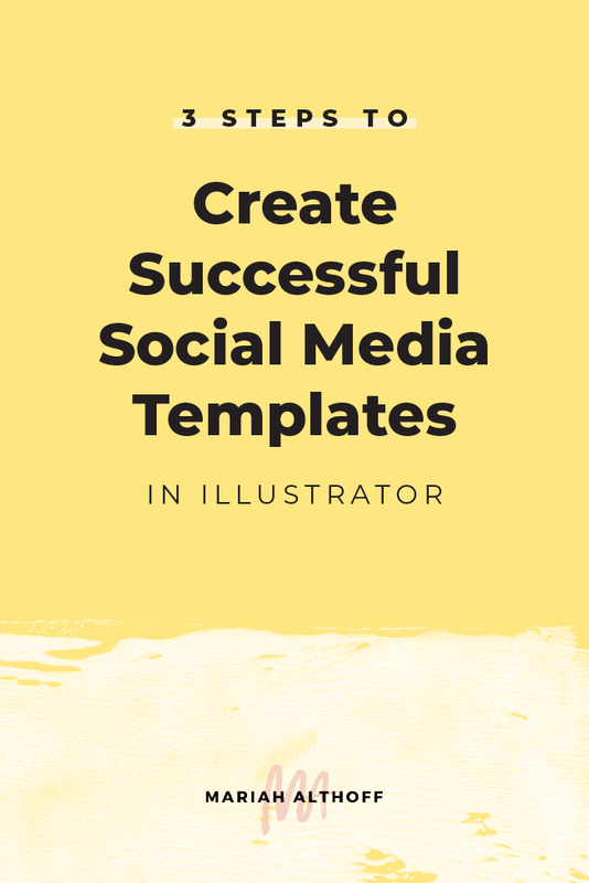
3 Steps to Create Successful Social Media Templates in Illustrator
Having a template for your social media graphics not only cuts your design time in half, but it also makes your brand look consistent and feel cohesive. If all of your graphics came from the same template, they'll all look like they came from the same brand. This creates great brand awareness and recognition as you begin to teach your audience what designs to look out for while scrolling through their feeds (yours – obviously).
As you can tell by looking at my blog post graphics, anytime you see an image with big, white paint strokes you can probably assume that it came from me! By using this social media template over and over again, my audience has learned to look out for this design in their social media feeds and therefore are more likely to click through to my blog post. People like and trust brands they're familiar with, so gaining this familiarity through design is crucial in gaining life long fans.
If you’ve read a post or two from me, you probably know about my love affair with Adobe Illustrator. I use it for literally EVERYTHING and social media graphics are no exception. One of my favorite time-saving Illustrator features is the ability to save a file as an Illustrator Template, rather than just your typical Illustrator file. This ensures you can’t accidentally save over or screw up your original template so that you can use it over and over again.
For some of you, it may make sense to create several different social media templates for each type of post you publish. I personally have a template for my blog post graphics, a template for my infographics, a template for my color palette posts and a template for my quote graphics. Setting up these social media templates is super easy to do in Adobe Illustrator, so making several is totally worth it! Just follow the three simple steps below and save your future-self hours of time. You’ll never need to recreate a brand new social media graphic again!
Step 1 | Create a versatile design
Before you start creating your social media templates in Illustrator, you need to first design the overall layout of your images.
Your social media graphics need to be flexible enough to accommodate different information, photos, and text, while still having distinguishing design elements that are carried between each graphic. The key to this step is finding the perfect balance of never-changing elements and ever-changing elements within your social media template.
Here are a few things to consider when creating your social media template in Illustrator:
Keep them simple
Because these graphics need to be pretty versatile, the simpler the better. Stick to only a couple design elements and use those consistently from graphic to graphic. For me, these consistent design elements are the white paint swashes, a bottom banner with my website URL, and sometimes a top corner banner showcasing my freebie.
Rotate through your brand colors
To keep each graphic fresh and different, try sticking to 1-2 brand colors per graphic and rotate through them each time you create a new social media graphic. This is a great way to keep your graphics simple while allowing space to create variety among them as a whole. I keep a palette of my brand colors in the workspace outside my art board so they’re easily available for me to pull from.
Related Post –>> How to Choose the Perfect Color Palette for Your Brand
Include a small branded element
Make sure the graphic is specific to you and your brand by including a small logo, sub mark, icon, business name or website URL. This adds both consistency and brand recognition to your social media template.
Rotate backgrounds
I personally like to make my social media templates work with both an image background or a solid color background. This is another great way to keep the template’s overall design consistent while making each graphic unique from one another.
This also sets you up for success down the road, in case you can't find a stock photo that matches your content. Just throw a brand color in the background instead and you’re good to go!
Use consistent fonts
The fonts you’re using for your social media graphics should be the same 2-3 fonts you use for your branding. These should stay consistent throughout each graphic. This cuts down on design time, helps increase brand recognition and ensures your graphics look nice and cohesive.
Related Post –>> How to Choose the Best Font Pairing for your Brand
Include guides
I personally have a few guides set up in my design, to outline bounding boxes that I keep my text inside of. This may or may not apply to your design, but if there are certain areas you need an element to stay within, set up a few guides within your design!
You can set up guides by first making your rulers visible. The shortcut for this is “Cmd + R”, or you can go to View > Rulers > Show Rulers.
Once your rulers a visible, click and hold on one of the rulers and drag your cursor out to your art board where a blue line will appear. This is a guideline which is only visible when you’re working in Illustrator. Drag them around accordingly to put them into place.
Once they’re set up where they need to be, you can lock them into place by going to View > Guides > Lock Guides.
Here’s a look at how my template is set up:
Step 2 | Separate into layers
Once you have the final design for your social media graphics, it’s time to start turning it into a working template. The easiest way I’ve found to arrange my templates is to first separate your design into layers.
I personally have a background layer set up for my photo and/or color overlay, a layer for my bottom bar and URL, a layer for my paint strokes, a layer for my text, a layer for my freebie banner and a layer for my guides.
Separating your file into layers helps you edit one element at a time and stay more organized throughout the process.
Create a new layer by first opening your layers panel, by either choosing the layers icon in your toolbar or by going to Window > Layers.
Once your layers window is open, you can add a new layer by clicking on the icon that looks like a square with a corner bent back, next to the trash can.
Rename that new layer by double-clicking on the existing layer name.
As you can see, each layer has a color associated with it. When you select something in your workspace, a little, colored square in the layers panel represents that selection and indicates what layer it is already on. You can move objects to a new layer by selecting them in your workspace (hold the shift key down to select multiple objects at once) and then click and drag this colored square in the layers panel onto the new layer you've added.
Make sure that your layers are in order from top to bottom, otherwise certain layers may get covered up!
Step 3 | Save as an .ait file
Have your layers all sorted? Great, you’re almost done!
Click File > Save As and change the file type to an .ait Illustrator Template file. Click save and you’re good to go!
Now every time you click to open your social media template, it will open your file as a new document, eliminating any risk of accidentally screwing up or saving over the original. How easy was that?!


