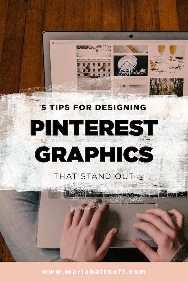
5 Tips for Designing Pinterest Graphics that Stand Out
*Anything marked with an asterisk is an affiliate link – I promise I only promote products I love and use myself!
For many bloggers and online business owners, Pinterest is their #1 traffic source – I know it is for me! Over 50% of my traffic comes from Pinterest alone – and it’s totally transformed by business. Not only does my Pinterest run on autopilot thanks to Tailwind*, but it brings in relevant, new traffic every single day. (In fact, there is a very good chance you found me on Pinterest initially too!).
Even if you have thousands of followers, you may not be bringing in the traffic your website deserves – all because your Pinterest graphics aren’t standing out amongst your competition. Designing Pinterest graphics is a science that goes beyond just “looking pretty”. Your Pinterest graphics need to command attention within your audience's busy Pinterest feeds, while still keeping its design relevant to your content and aligning visually with your brand.
Sound difficult? It's not! Just follow these 5 easy tips I’ve outlined below and you’ll be designing Pinterest graphics that stand out in no time!
1. Vertical Pins
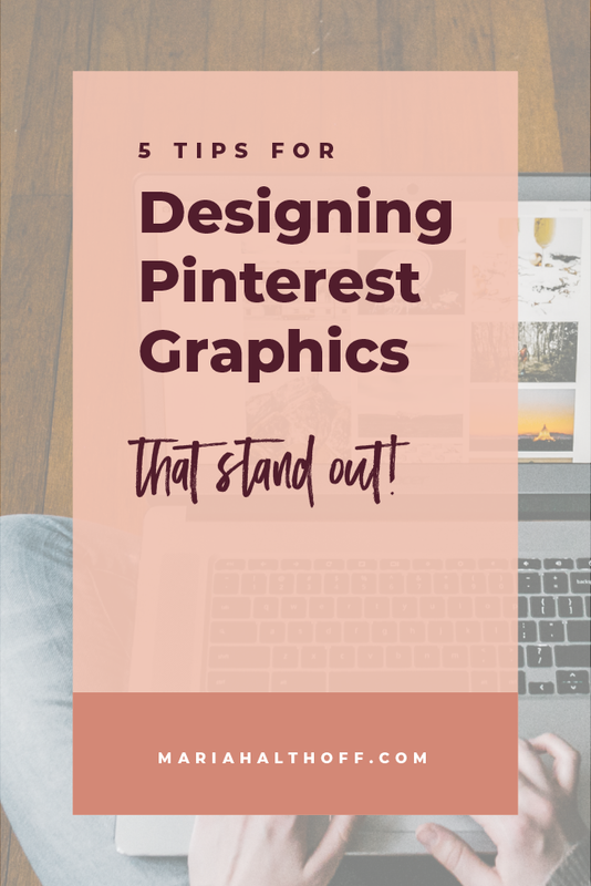
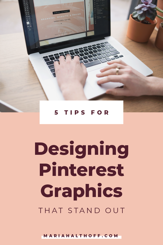
This is by far the most important factor in designing your Pinterest graphics. Long, vertical pins stand out purely because they take up more room in your Pinterest feed. The more space it occupies, the more likely someone will notice it. That means that even if you have the ugliest Pinterest graphic ever, it will still stand out above the prettiest horizontal graphic. (I told you this stuff was easy!)
Horizontal and square pins are too small to compete in your Pinterest feed. The longer the Pinterest graphic, the more likely your audience will notice them. My highest repinned graphics are typically my infographics because they are always 2-3x the length of my regular blog post graphics.
The typical size of a vertical pin is around 800x1200px. Sizes can vary, but staying close to this ratio for a typical blog post graphic will be helpful to get you started. However, if you’re creating an infographic, make your pin even longer!
2. Large, Attention Grabbing Text
Large and attention grabbing text is crucial for designing Pinterest graphics that stand out. Because Pinterest is such a visual search engine, ensuring your text is large, attention grabbing, and easy to read, increases your likelihood of standing out amongst competing pins. Unless your imagery is super compelling, your text is most likely going to be what draws people in. If it’s easy to understand what your pin is about, new followers that relate to your niche will be more likely to click through to your site.
Not only does your text need to be large and legible, but it also needs enough contrast between the background and the text. I often see Pinterest graphics with great, compelling images, but the text on top of it is difficult to read which automatically impacts the pins performance. Make sure your background colors and text colors have enough contrast, and/or that your font is bold enough that your text easily stands out.
Make it as easy as possible to glance over your image and understand what it’s about!
3. Differentiate Yourself from your Competition
This is probably the most difficult tip to implement but is possibly the most beneficial. You’ve probably noticed that the majority of Pinterest graphics have all taken on a similar design trend and are all looking more and more alike. That's okay if this style matches your brand, but if you can come up with a Pinterest graphic that people haven’t seen before (or don’t see often), people are way more likely to notice it. Being trendy has its own advantages, but when it comes to your Pinterest feed, individuality will pay off more than trendy will.
Here are a few ways you can do this:
Break up the grid of your Pinterest feed with new angles or organic shapes within your graphic
Use a fun accent font that grabs people’s attention
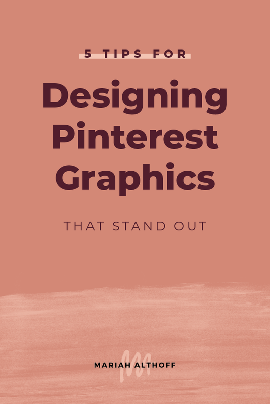
Make your pins overly simple so they stand out from the overly designed
Design your pins to be extra long to take up more real estate than most – even if they are just for blog posts
The possibilities are endless!
I implement this tip by using paint strokes behind my text. Not only have these paint strokes become a staple in my visual branding that helps build my brand recognition, but they also give my graphics a way to be different and stand out from the crowd. These white brushstrokes also give my black text the most amount of contrast possible, while serving as a super organic shape that helps break the grid of the Pinterest feed.
4. Using On-Brand Fonts and Colors
This is a point I always drive home when it comes to ANY graphic you create, so naturally designing your Pinterest graphics is no exception.
Using on-brand fonts and colors not only increases the cohesiveness of your brand, but it also increases brand awareness. By using consistent brand elements, your audience will begin to associate your visual brand with your content and will be more likely to repin or click through to your content more consistently.
People connect with brands they recognize, so make sure your brand can be easily remembered and recognizable!
5. Create a Template
This is the easiest way to implement all four of the previous steps, consistently and effectively. By creating a template you’re increasing your brand recognition and cohesiveness by leaps and bounds.
Not only will your pins be more and more recognizable, but designing a template will also cut your design time in half because you’ll never need to fully redesign a Pinterest graphic ever again!
I wrote an entire post on how to set up a Pinterest template here. Check it out right meow!
