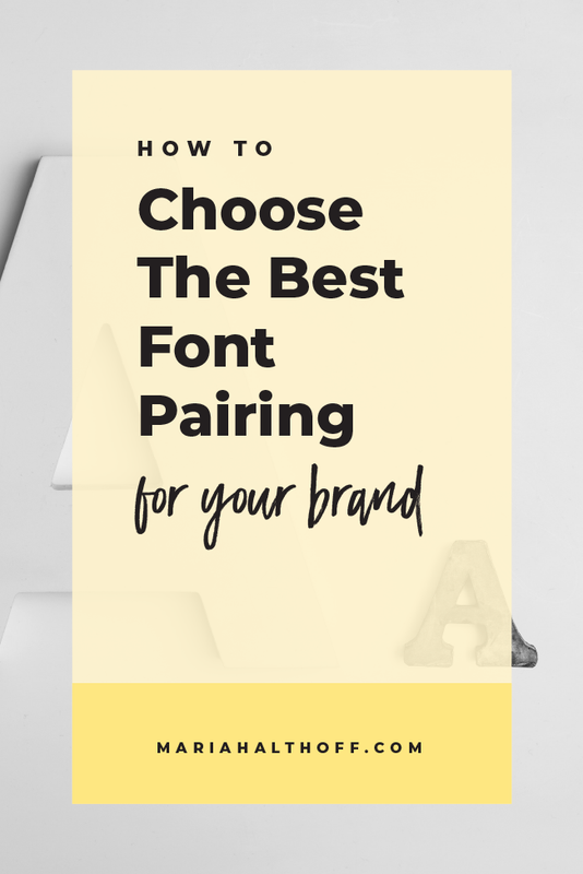
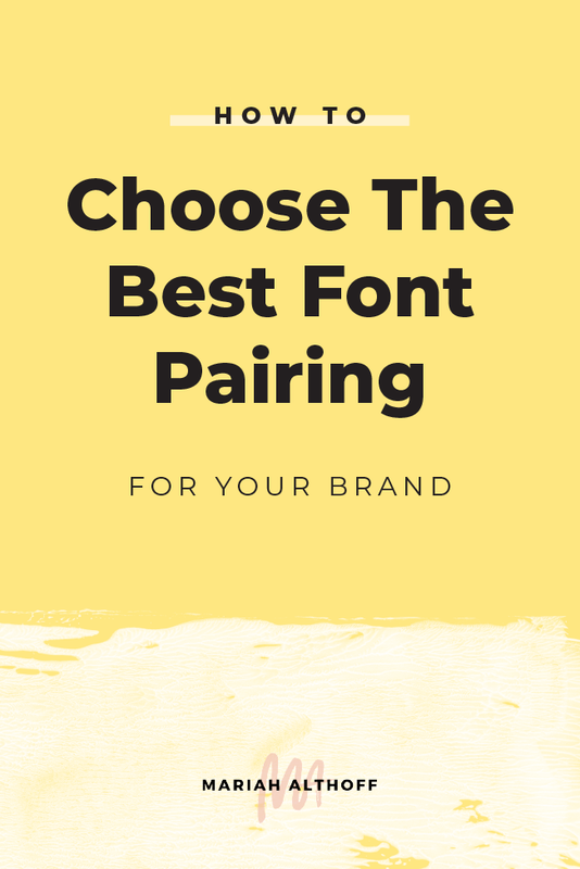
How to Choose the Best Font Pairing for your Brand
*Anything marked with an asterisk is an affiliate link – I promise I only promote products I use myself!
I talk all the time about how consistent brand identities can transform your business. By having a solid, cohesive visual brand, you’ll immediately be taken more seriously among potential clients and can, therefore, charge premium prices for your products or services. One of the easiest ways to ensure your brand identity is cohesive is by choosing 2-3 fonts for your brand and sticking with them for everything. I’m serious… e.v.e.r.y.t.h.i.n.g. Whether it’s content pieces or graphics or quotes or social media templates or branded cat memes (because we’re all creating branded cat memes right?). Whatever it is, use the same fonts across the board!

Why oh why can I only choose 2-3 fonts?!
By sticking to just a few fonts, your brand is automatically more cohesive and therefore more visually appealing. This keeps your brand looking clean, put together and well thought-out. Most importantly, it immediately begins to build brand recognition. The more times your target audience sees your brand’s unique font pairings – especially in combination with your brand colors and/or imagery – the more recognizable (and therefore memorable) your brand will be.
I know it’s tempting to use ALL OF THE FONTS. There are so many pretty ones and you don’t want any of your favorites to feel left out! But, I promise that by choosing just a few to use consistently, your brand will be much more impactful in the long run.
Many beginner or DIY designers want to change up their fonts depending on the topic they're writing about or advertising. BUT, for example – just because you’re a food blogger and have a new recipe for spaghetti, doesn’t mean you should find a fun, noodle-y font to use for your social media graphics. Noodles + Noodle-y Fonts ≠ a compelling graphic (although all this talk of noodles is making me hungry). It may seem more fun and exciting for that particular post, but in the long run, your brand benefits immensely if you stick to your branded fonts for every graphic you create.

Okay okay, I’ll pick 2-3 fonts because I want my visual branding to be off the chain. I got it.
But how do I choose the best 2-3 fonts for my brand?
I recommend choosing a designated header font, a body font, and possibly an accent font.
Header Font
Your header font is the font you will use for titles, announcements, important information or anything else that needs to grab readers’ attention. This font is usually the largest of all of the text (with the exception of sometimes the accent font) and should be easily legible. That way when the text is glanced over, the reader can easily understand it or identify important words without much effort.
Body Font
Your body font is the font that you’ll use for paragraph text, details, and possibly sub-headers. Anything that is smaller and doesn’t compete for attention. This font should also be easy to read and simple, considering it will usually be the smallest text size and often used for large amounts of text. Your body font should complement and relate well to your header font, as they will often be paired together.
Accent Font
If you choose to have an accent font, this can be a fun, out-of-the-box font that dramatically stands out among the other two. This might be a fun cursive font, a brush font or even a hand-lettered font. This font will often be used to accentuate a word or a phrase to grab readers' attention because it’s so visually interesting.
Here are the fonts I used for my brand (as if you couldn’t already tell just by reading my blog…).

So how can you come up with your own font pairing?
Write Down 5 Key Words for your Brand
For example, my visual branding balances between sleek and modern mixed with a creative and artistic vibe. Therefore, I've chosen my five brand words to be: clean, modern, sleek, artistic and creative.
Find fonts that match these words, then use your favorite(s) as your Header (and Accent) Fonts.
Modern Brand Fonts
If your brand is more modern, chic, sleek or clean, I would recommend looking at sans-serif fonts. Sans-serif fonts are those without the little feet at the ends of the letterforms (like the font I use for my brand). I personally LOVE sans serif fonts because they’re clean and easy to read. I use a sans serif font for almost every brand I design. (CANT. STOP. WONT. STOP.)


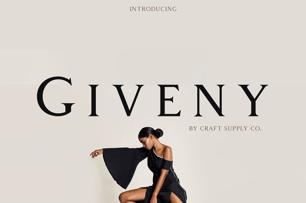
Classic Brand Fonts
If your brand is more classic, inviting, friendly, or simplistic, try looking into serif fonts, which as you can probably guess ARE the fonts with the little feet at the ends of the letters. These fonts give off more character while making your brand feel timeless and sophisticated.


Fun + Creative Brand Fonts
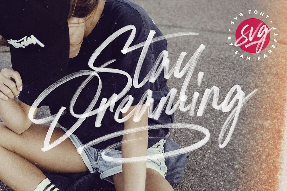
If your brand is more fun, funky and creative, try looking at hand lettered fonts or brush fonts (try DesignCuts* – they have SO many good brush and hand lettered fonts! I literally could buy them all if I had the cash-money). Some bolder sans-serif fonts work great for this aesthetic too.


Vintage or Rustic Brand Fonts
If your brand is more rustic-chic, vintage or hipster-ish (I made up that word), try looking at serif fonts, old-school typewriter fonts or fonts with texture and grit to them (DesignCuts* can also be a good place for these too!).


Feminine Brand Fonts
If your brand is super feminine and pretty, try looking at pretty cursive fonts or classic serif fonts (or both!).


Related Post –>> How to Design a Feminine Brand (+ Resources to Help You Do So!)
Once you've chosen your header and accent fonts, choose a simple font to pair with them. This will be your body font.
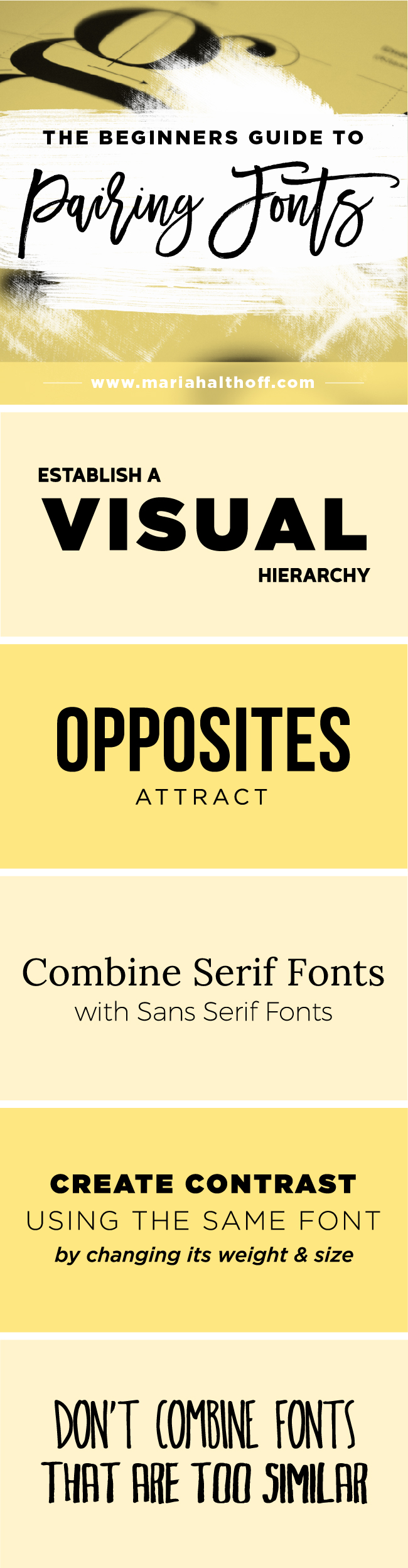
5 Rules for Combining Fonts
Establish a Visual Hierarchy
A visual hierarchy establishes the order of which someone sees and processes your visual information. Either your header font or your accent font should be the first thing people see. A visual hierarchy establishes the order of which someone sees and processes your visual information. Make sure one of your fonts is more dominant than the other (either in weight, size, color or character), in order to create a visual hierarchy. You'll want to use this dominant font for headers and other important information, in order to direct the reader around the page accordingly.
Opposites Attract
If your header font has a lot of personality or character, pair it with a simple sans serif font. This helps balance your font pairing, while also ensuring an effective visual hierarchy. If both of your fonts have a lot of character, they won't feel cohesive and will create an awkward tension as they compete for dominance.
Combine Serif Fonts with Sans Serif Fonts
If your header font is a serif font, try combining it with a sans serif font, and vice versa. This is one of the easiest ways to create an evenly balanced and successful font pairing.
Create Contrast with Font Weight
For my brand's font pairing, I use the same sans serif font for my header and my body text. However, I change the weight of the font to differentiate the two. For example, my header font is either Gotham Bold or Extra Bold while my body font is Gotham Light. This allows for an easy, clean font pairing while still distinguishing a visual hierarchy.
Don’t Combine Fonts that are Too Similar
Using fonts that look similar but are not exactly the same doesn’t work well. Your pairing becomes complicated and confusing and creates unwanted competition between the two. Make sure your fonts have enough contrast that it’s clear which font is more dominant than the other.