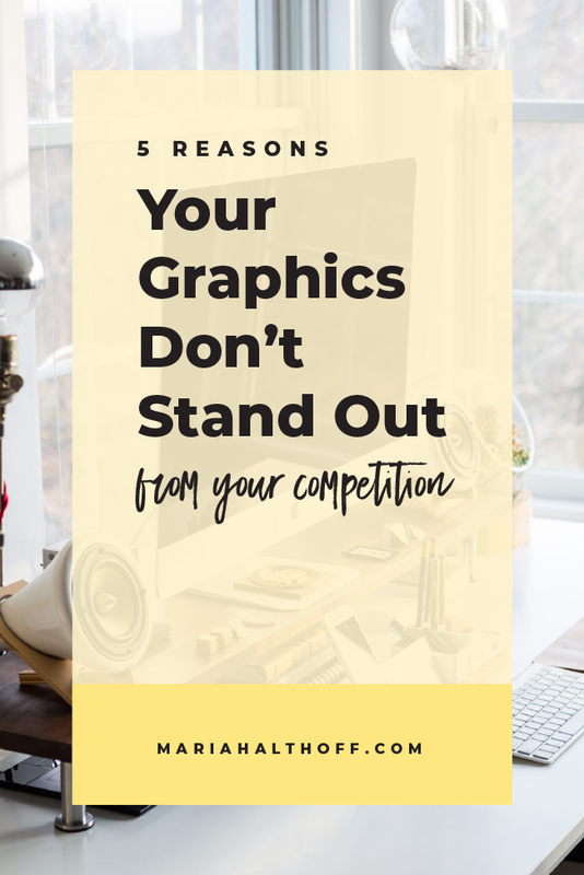
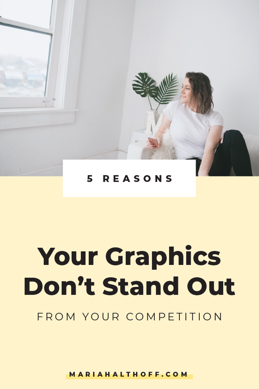
5 Reasons your Graphics Don’t Stand Out from your Competition
How tired are you of only getting a few re-pins on Pinterest because your graphics don’t stand out in your audience's newsfeed?
How irritated are you with trying to design what you’re envisioning, only to be restricted by the limitations placed on you by free, online programs, like Canva?
How annoying is it, that despite your best efforts, your graphics still suck?
Guys I’ve been there. Believe it or not, I once had ugly graphics too. (I’m serious, I didn’t even get into the design program in college the first time I applied because I was a crappy designer).


Luckily, as you can (hopefully) see, I’m on the other side of that hump! Sooo, I’m here to fill you in on what you’re doing wrong, just as I was many years ago (okay it was only like 5 years ago, but that’s like a fifth of my life so it seems like forever, ya feel?).
Graphic design is absolutely a learned skill and not something that comes easily to most. I swear you don’t need to be naturally talented or even naturally creative to be a good designer (learn more about this in point #5).
So takes these tips to heart and feel confident in your ability to improve because I know you can turn this ugly-design train around, just like I did!
Here are 5 reasons why your graphics aren’t standing out from your competition:
1. You’re over designing
I completely understand the feeling of needing to add a bunch of design elements to the page in order to feel like it’s well designed. I STILL get these urges sometimes, so I totally get it!
Fortunately, I now know to fight these urges, because, in the world of design, less is more, people.
Don’t believe me? Look at Apple. They’re the KING of minimalism and have one of the best-designed brands because of this.
I know that it’s a really hard concept to overcome at first, but once you’ve gotten past the need to put tons of crap on your graphic to feel like you’ve done something, you’ll have accomplished the first step to becoming a professional designer.
To get to this point, here’s a great rule of thumb to follow:
If the text, design element or image doesn’t have a specific purpose on the graphic, leave it off. Do not just add things for decoration. You can definitely have decorative elements, but use them only because they have a specific purpose like they tie into your brand or balance out the graphic. Not because your graphic “needs more decoration”.
See the difference here?
Graphic design isn’t about decorating a graphic. Instead, it's strategically placing design elements on the page to engage the viewer and deliver a message.

2. You’re using the same templates as everyone else (because you’re using the same free programs as everyone else)
How many of you can spot a Canva template a mile away? Raise your hand 🙋🏻
My hand is raised, y'all.
If your graphics are laid out the same way as everyone else’s on the internet, why do you think they’re going to grab someone's attention?
Here’s a hint – they’re not.
The key to grabbing someones attention is to break the grid. Show them something their eye hasn’t seen before. Make it hard for them to just glance over your graphic like they did with the last 20 before yours. Give them a reason to stop and read what your graphic says.
How do you do this? By using a design they haven’t seen a million times before. Use a new layout. Create your own template. Show them how you’re different and force them to pay attention to you because you interrupted the pattern on their social media feeds.
Related Post –>> 3 Steps to Create Successful Social Media Templates in Illustrator
3. You’re designing graphics that are trendy, rather than branded to your business
Okay so maybe you’re not using the same template as everyone else – but do your graphics still look like theirs?
It’s so easy to get caught up in design-envy that you're tempted to create graphics that look just like someone else’s. But guess what? That’s how everyone’s graphics end up looking the same. When this happens, no one stands out from one another!
This goes right along with the last point of breaking up the monotony of the feed by giving the viewer something they haven’t seen before – or at least something they don’t see ALL the time.
If you don’t know what I’m talking about, go look at your Pinterest or Instagram feeds. You’ll probably find that 70% of the people in your niche are all producing graphics with a super similar look and feel.
But guess what, only a small percentage of those people are actually making a killing online – and it’s probably because they were the first to come up with this overall style in the first place. Just because a certain design is working for someone else, doesn’t mean you have to copy it for it to work for you too. It works for them because they adopted it early in the game when it was new and interesting, which allowed them to grow a following. Once you have a large following, standing out from the crowd is a lot easier, even if everyone else has copied you by this point.
But, if you're just following along in their shadows, all you’re ever going to be is in their shadows when instead, you should be leading the pack in your own unique way.
Show your audience that you’re unique and have something to offer by first showing them graphics they haven’t seen a million times before.
4. You’re not creating any brand recognition
In order to really get noticed, your potential audience needs to see your graphics numerous times (they say up to seven times) before they want to interact with you or become involved with your brand.
This doesn’t mean, however, they need to see the same graphic seven times. They just need to see the same BRANDING seven times.
Therefore, if you don’t have a solid brand identity, you’re leaving tons of money (or at least potential audience members) on the table.
So how do you avoid this? By sticking to the same brand elements over and over and over and over again.
This means you use the same 2-3 fonts, the same color palette, the same branding style and the same few layouts every single time you create a new graphic.
If you’re someone who just likes all the things and can’t stick to using the same fonts, colors and branding standards every single time… I get it, but it’s time to suck it up and make a decision because you’re not doing yourself any favors. In fact, you’re hurting your business – and that ain't cool.
5. You haven’t been properly trained (but that can change today!)
Guys, did you realize that there are actual RULES to graphic design?
Although design seems like an art form, it actually more of a science. It’s way more structured and regimented than you might have realized – and the only reason you didn’t know this already is because you haven’t been properly trained!
This is totally normal and again something I came to realize in my journey to becoming a graphic designer. Before I had taken actual design classes, I had no idea there were rules to follow and specific ways you needed to set up and save out files.
When you teach yourself graphic design, it’s hard to actually get all of the information you need from piecing together tutorials. Learning graphic design goes way beyond just watching a few YouTube tutorials to really improve your design skills. You need the whole package – design principles, design rules, technical training, and practical knowledge.


